
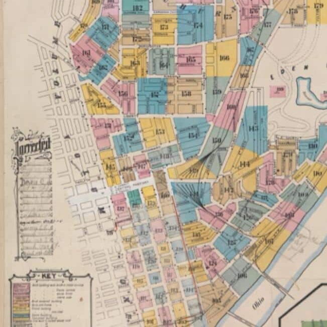
Have an old building you are trying to understand? Start with a Sanborn Map.
I use Sanborn Fire Insurance Maps constantly in my work with historic buildings. They can reveal what a building was used for, how it was constructed, how many stories it had, where stairs and elevators were located, what materials were used, and even how a property changed over time.
The problem? If no one has ever taught you how to read one, a Sanborn Map can look like a colorful mess of lines, letters, numbers, and symbols.
So I created a guide.
Reading the Past: A Beginner’s Guide to Sanborn Maps is a free, visual introduction to finding, navigating, and interpreting these incredibly useful historic research tools.
What Are Sanborn Maps?
Sanborn Maps were originally created for the fire insurance industry beginning in the mid-1800s. Because insurers needed detailed information about buildings and the risks associated with them, the maps documented far more than property lines.
Depending on the map and year, you may be able to uncover information about:
- historic building uses,
- construction materials,
- building height and number of stories,
- wall thicknesses,
- windows and doors,
- stairs and elevators,
- roof construction,
- porches and awnings,
- utilities,
- neighboring buildings, and
- buildings that previously occupied the site.
For anyone working with adaptive reuse, historic preservation, or an older downtown building, that information can become an important part of understanding what you have before deciding what it can become.
Why Sanborn Maps Matter for Adaptive Reuse
Historic buildings rarely arrive with a perfect set of original drawings tucked neatly into a filing cabinet.
Sometimes the building itself is the best record you have. Sanborn Maps give us another layer of evidence.
Comparing maps from different years can help establish when a building appeared, how it expanded, how its use changed, or which features may be original. That history can inform early feasibility work, preservation decisions, and Historic Preservation Tax Credit applications.
In other words, this is not research for research’s sake. It can directly inform the path forward.
First, You Have to Find the Right Map
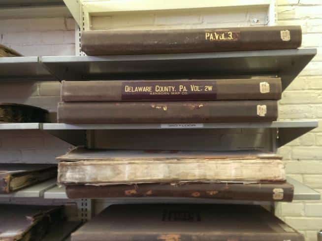
One of the first things the guide explains is how Sanborn Maps are organized.
A single community may have multiple editions from different years. Larger cities may then be divided into volumes, with each volume broken into individual sections or sheets.
Street names and addresses can also change over time, which means finding your building sometimes requires a little detective work.
Many Sanborn Maps are now available digitally through the Library of Congress. In Ohio, maps can also be searched through the Ohio Web Library. Physical collections are held by libraries and universities around the country.
Then Comes the Fun Part: Learning the Code
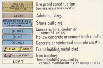
Sanborn Maps are remarkably detailed because they use a consistent visual language to communicate a huge amount of information in very little space.
Color is one of the easiest places to start.
For example:
- Yellow generally indicates wood-frame construction.
- Red indicates brick.
- Blue can indicate stone, concrete, or cinder block.
- Olive green or brown can indicate fire-resistive construction.
Then there are letters, numbers, dots, dashed lines, wall markings, and abbreviations.
A “D” can indicate a dwelling. An “S” can indicate a store. “Vac” tells you a space was vacant. Numbers can reveal everything from a building’s height and number of stories to wall thickness, street width, and address.
Once you begin understanding the language, what initially looked like a messy old map starts telling a remarkably detailed story.
If you own an older building, are considering purchasing one, or work in preservation, planning, Main Street development, architecture, or community revitalization, this guide is for you.
Download it. Save it. Share it.
There is no email form and no gate. We simply want more people to have practical tools for understanding the old buildings that make our communities special.